8 Ecommerce Design UX Trends For The Future
Where do you prefer to shop? Online or in-store? With the ever-growing popularity of eCommerce, it may be high time brands started to switch the focus onto perfecting their eCommerce strategy.

8 Ecommerce Design UX Trends For The Future

Where do you prefer to shop? Online or in-store? Well, with the ever-growing popularity of eCommerce, it may be high time brands started to switch the focus onto perfecting their eCommerce strategy.
During the last year, eCommerce has seen a tremendous amount of growth, accelerated by the Covid-19 pandemic. Due to the physical store closures, even those who were avid high street shoppers switched up to online shopping. The pandemic gave a push to the fence-sitters and older generations who perhaps weren't as accustomed to eCommerce. In a world where convenience and efficiency have become a priority, eCommerce gained popularity offering a quicker, easier, less stressful alternative to hitting the high street. So while the pandemic precautions seem to be drawing to an end the growth for eCommerce is here to stay.
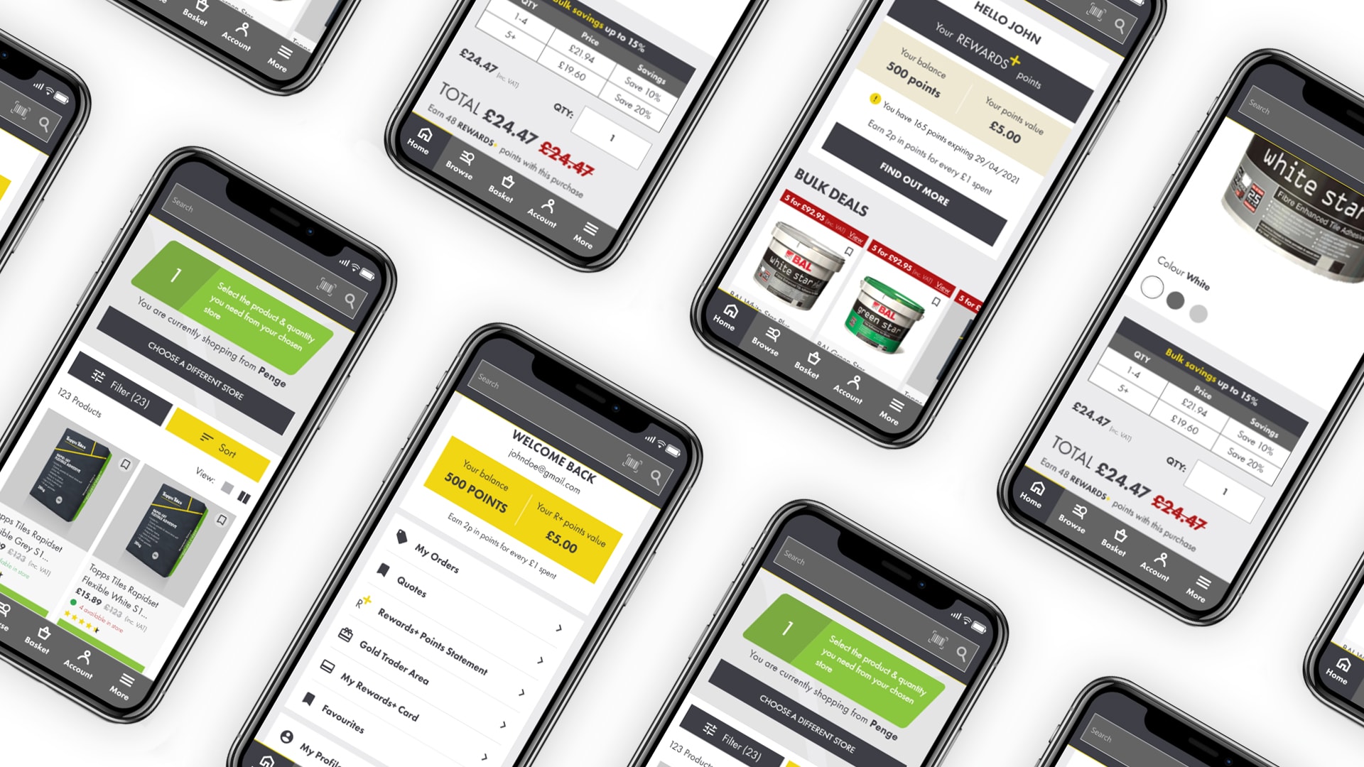
But what makes a truly excellent eCommerce experience? While brands may benefit from reduced costs with few or no physical stores, a truly great eCommerce experience entails bridging the gap between real-life and online experiences. This is mostly achieved through considerate thinking and design.
Our expert design team sat down and put together their top 8 trends for making the most out of their online stores and creating customer experiences that keep them coming back.
Mobile-first
Fun fact; 65% of traffic to retail sites is seen to be coming from mobile, and 53% of all online sales. An eCommerce brand would be mad not to think mobile-first. The online shop should work across all devices, allowing shoppers to effortlessly shop on the go.
But what does mobile-first really mean? Mobile-first means designing the website for mobile and then expanding out to the desktop. Only a few years ago, we did this in reverse.
Designing mobile-first also means that we're starting to see more elements that before were reserved specifically for mobile carried upwards to the big screen. For example, many modern sites now use a 'hamburger menu' on the desktop versions of their websites.
Taking this one step furthermore, mobile sites are beginning to look and feel like native apps, rather than mini desktop websites. For example, they are using elements previously only seen on apps such as 'trays,' meaning the navigation bar is on the bottom much like with Instagram. Breadcrumb trails such as 'categories/clothing/tops' have also been scrapped on mobile to simplify the experience and avoid navigating through multiple pages.
In the pursuit of building a mobile site that acts like a native app, there has been enormous growth in the popularity of PWAs. A PWA is a 'Progressive Web App', which means that they use web technologies like the forever infamous HTML, CSS, and Javascript but allow the user to install the website to their phone as you would any other application.
Combined landing and product pages

Traditionally the user journey for most eCommerce websites was something like: the user entering the homepage; navigating through to the category listing page; following through to a product listing page; before finally arriving at a product description page. Well no longer! This approach today is a little dated. We no longer access a website directly to its homepage as we have done in the past. A lot of webpage traffic now comes from SERPs (search engine results page) or social media navigating the user directly to the product page without having to go through the preceding steps.
Taking this into consideration the PDP (Product Detail Pages) is often used to display all the needed information needed to make a buying choice. Treating PDPs more like landing pages allows the store to better represent its brand as well as including elements not typically seen on PDPs such as the brand's USPs (unique selling points), CTAs (calls to action), social proof, and much much more.
Giving the customer everything you want them to see on the one page, essentially treating the product page as a homepage for that specific product. eCommerce pages that act in this way have been seen to be considerably more effective at converting.
Visual commerce

Now to go back to the beginning. We mentioned any effective online store that aims to match the online experience to the physical as much as possible. That's where visual eCommerce comes in.
But how do we achieve this? eCommerce websites should aim to show their products from many angles, make an effort to clearly portray materials, and show the product in use; for example, showing apparel on models of varying sizes to give the user the best possible idea of what they are buying.
Video is a fantastic tool to bring a product to life in a more engaging way than a static photo. Especially in fashion, retail videos effectively show how items fit. This tactic can be complimented through User Generated Content as it shows the brand's transparency around its quality and care for customer reviews.
You can also get creative with it such as creating a render that the user can move about in 3D space and even allowing the user to interact with the product in augmented reality. Through modern technology, all of these are becoming ever increasingly accessible to big and small businesses alike.
In 2017 Ikea paved the way for AR experiences in eCommerce allowing users to place their products in their own homes through the camera on their phone. Clever huh!
Following these practices to allow the user to have the best understanding of your product often means that eCommerce websites will convert higher and since the customer knows exactly what they are getting, returns should significantly reduce.
Motion

Ironically motion really does stop the customer in their tracks. It is immediately attention-grabbing and engaging. The good news is, the use of motion is limitless. From animated Icons, loading bars, buttons, as well as page animations like page load animations, page transitions, and scroll animations. The mind boggles! Lots of online shops now use animation but it is important to keep in mind that this can sometimes be jarring and have a negative effect if not thought about considerately.
When talking about motion we can't exclude micro-interactions. These may be small but don't underestimate them. Be it an icon animation on hover, or hover states of a clickable area. These really make the difference in designing an immersive and responsive experience.
Through the use of motion, you can gamify the online experience by rewarding the user with a nice animation for a positive action or alerting them of a negative one. This makes for a more visually interesting and memorable user journey.
The most important points to take into consideration when including motion on any website, but especially in eCommerce are:
-
Are you overdoing it? Are you adding to the user's experience or just animating for the sake of it making things confusing and interrupting?
-
Do the animations and micro-interactions work correctly and appropriately responsively?
Chatbots

Chatbots are hardly a new topic, they've been around for quite some years, but year-on-year they are becoming more advanced - and at great velocity. In the past chatbots could be thought of as quite primitive and more of a gimmick offering more hindrance than help, but in the present day, they've greatly advanced and can be a real asset on an eCommerce website.
Chatbots have been especially helpful during the pandemic for brands where the phrase 'try before you buy' rings true. For example in the fragrance industry. In response to this, for our client Creed, we implemented a third-party platform, named hero, to hastily roll out a new chat feature to allow online customers to connect with in-store fragrance experts from the comfort of their homes.
A hop in a time machine: Chatbots are a major leap using AI in eCommerce although according to research (capgemini.com) in just the next 3 years 70% of customers will replace in-store visits with voice assistants. After all, for essential products that the user doesn't necessarily have to see or read a lot into simply saying "Hey Alexa, buy me some bread!" is a lot more simple a task that than, putting your coat on; travelling to a store; finding the product you want; going to the checkout; travelling home.
Unconventional layouts

Recently we've seen many brands moving away from the traditional eCommerce site layout. Breaking the grid and creating more experimental layouts that are visually interesting.
Design is the key factor in doing this. Such unconventional layouts could include: asymmetrical alignments, large text or images, scroll jacking, and horizontal scrolling just to name a few. The main advantage of this is giving the eCommerce website a more dynamic and interactive experience. Through using these 'different' design styles the brand can better express its personality and set itself apart from competitors offering a truly unique and memorable experience to its users.
By 'breaking the rules' and designing the site with less regard to the grid and/or tradition, more emphasis can be placed on certain areas that need to stand out.
Should everyone use an unconventional layout? Well, in truth, the use of highly designed pages often lends itself better to luxury or boutique sites with fewer products. These types of pages can often look more expressive and visually interesting but do create a challenge when attempting to display a large number of products or create a visual hierarchy through a lot of content. Due to the nature of these experimental designs often including large images and text, attempting to show many products simply cannot be done in a user-friendly manner; the page would become excessively long making it difficult to navigate and creating an all-around bad user experience.
Minimalism & Accents

The minimalist movement within UI design is again, nothing new, but we are seeing it become more vastly adopted by brands. Minimalist web design is becoming ever increasingly experimental and playful, such as experimental typography. Examples include 'huge' text sizes to draw attention, and/or a combination of serif and sans serif fonts to emphasize particular content. Being more experimental with type allows for brands to express their personality without adding additional elements and overcrowding a page.
Minimal UI is the perfect way to create a clean, crisp, and elegant experience, with accents to drive the user's focus to key areas. It is often high-contrast allowing the content to be easily digested by the user as well as offering accessibility to visually impaired users. The key to minimalist design is only including content on a page that offers some value to the user; to make the most of the content available it is often more designed than on traditional websites.
Personalization

Addressing the individual user's needs is now essential in eCommerce. Personalizing content to specific users makes it easier for them to browse the way that they want to, as well as makes them feel more considered and appreciated by the brand.
We have all heard of (and accepted many!) 'cookies.' Not the chocolate chip biscuit, but a clever tool to remember users choices made on a website. For example, a user might select to view a PLP (product listing page), in a 4 column grid and sort products by 'best selling', using cookies a website can remember this decision, and provide these options already pre-selected when that specific user browses any other PLP.
When a person first accesses an eCommerce store they might not have a good idea of exactly what they are looking for. One great way eCommerce websites can overcome this is by adding in a quiz. A set of questions that the user can answer, (regardless of their knowledge of the product), and upon completion, the site can recommend what products they have that match the user's specific needs.
Offering personalised web experiences in eCommerce helps to streamline the process of purchasing and is proven to boost sales by 19%.
So there you have it! Our 8 eCommerce trends for the future. Your eCommerce website should offer the same level of experience as the physical store making it easy for the customer to find what they are looking for and not overwhelm them with unnecessary content. The focus is really on making the eCommerce experience as quick, easy, and helpful as possible and blurring the boundaries between the online and offline experience!
Want to read more insights?
View All ArticlesRelated Articles
Continue reading with these related insights and updates from our team.

Figma vs Sketch: The Battle of the Web Design Tools
If you've worked in web design for a while you probably remember designing sites in Adobe Photoshop. Now there are more options to choose from; one of these being Figma. We believe Figma is the best p...

Beyond the 'Big Bang' Launch: How We Design for Constant Growth
Tom&Co’s design philosophy moves beyond one-off launches towards continuous growth, integrating design, CRO, and technology in a ‘total commerce’ approach driven by real-world data.
%20(1).png&w=3840&q=75)
5 Ecommerce Design Trends to Keep Your Eyes Peeled for in 2023
The world of ecommerce is ever-evolving, and staying ahead of the curve can be tricky for online businesses. Our design team breaks down the latest trends to watch.
Explore More Solutions
Adobe Commerce (Magento) Development
Expert Adobe Commerce (Magento) and Magento development in London
E-commerce Strategy
Strategic e-commerce consulting for digital growth
SEO Optimisation
Technical SEO for e-commerce websites
Design & UX
User experience design for e-commerce conversion